Sometimes, You Should Give to Gain
Tell me the truth, how many times have you helped your friends move? If you own a truck, I bet your number is higher than most. Have you heard this quote before? “True friends are the ones who have a truck.” If you haven’t, it’s because I just made it up. But seriously, having a friend who has a truck will double your life’s pleasure and happiness. I also just made that up. But don’t you think there’s a bit of wisdom in that? You’ll avoid so many challenging hassles of life as you will eventually find that perfect couch on the Facebook marketplace or that patio furniture someone is giving away…all you need is a truck. Let me rephrase that. All you need is a good friend with a truck.
In exchange for a day of free labor and transportation from your good friends, how about some pizza and some beer? It’s an unwritten and obvious currency exchange: (Labor + Truck) = (Pizza + Beer) = Friendship —a perfect algebraic formula.
Until…you turn my age. Have you heard this quote before? “A herniated disc is not worth the free pizza & beer.” I just made this up as well, but there’s for sure 100% truth in it. There needs to be a different type of creative “currency exchange” at my age.
There’s a give and take in most healthy friendships, and that’s just natural. Did you know there’s a give-and-take relationship in a landing page design? But before we unpack the “perfect algebraic formula,” let’s recap our Landing Page Series and what we’ve learned so far:
- The difference between the Homepage and the Landing Page – Read it Here
- The Hero Image and Message Design – Read it Here
- The Stakes – Read it Here
- The Value Proposition – Read it Here
- The Guide – Read it Here
- The Perfect Paragraph – Read it Here
When an audience lands on your landing page, they find you because they are looking for a solution to their current struggle. Although they found you and can obviously see that all the bullet points above on your landing page speak directly to their soul, they are just not ready to commit yet. They just met you; it’s going to take some more convincing before they decide to go on a date with you.
So, how do you further foster this relationship with someone who just landed on your page? You offer something valuable to them in exchange for something valuable to you. You need first to brainstorm what would be valuable to your audience. Here are some examples:
- Ebook or Whitepaper: Offer a free downloadable ebook or whitepaper that provides valuable information, insights, or tips related to your industry or niche.
- Exclusive Webinar Access: Provide access to an exclusive webinar or online workshop that covers relevant topics of interest to your target audience.
- Discount or Coupon Code: Offer a special discount or coupon code for your products or services as a reward for subscribing to your mailing list.
- Checklist or Resource Guide: Create a helpful checklist or resource guide that addresses a common problem or challenge in your industry.
- Free Trial of a Software or Service: Allow users to sign up for a free trial of your software or service, giving them a hands-on experience of its features and benefits.
- Email Course Series: Offer a series of informative and actionable email courses delivered over several days, focusing on a specific topic relevant to your audience.
- Printable Templates or Worksheets: Provide downloadable templates or worksheets that can assist your audience in solving a particular problem or achieving a goal.
- Access to a Private Community or Forum: Grant access to a private online community or forum where subscribers can engage with each other and your brand.
- Free Consultation or Assessment: Offer a complimentary consultation or assessment for those who sign up, providing personalized insights or recommendations.
- Contest or Giveaway Entry: Run a contest or giveaway and allow participants to enter by subscribing to your email list. This could involve the chance to win a product, service, or exclusive experience.
Remember, the key is to provide something of value that aligns with your audience’s interests and needs. The more enticing and relevant your giveaway, the more likely visitors will want it.
So, what do you gain in return? Their contact information. Usually, their first name and email. Why? Because in order to foster a relationship, you need their digits. You’ll need to start building a relationship. How? Start communicating together through email. Here’s a great article I wrote on why and how to do this.
I can’t tell you how many times a visitor to my landing page who opt-in/subscribed to my emails contacted me after reading my emails week after week, year after year. They enjoyed my communication, and I eventually earned their trust. This is when the plan + formula all comes together. This is when the labor + truck finally equals pizza + beer.
This concept of a give-and-take exchange is the finale of the series. This concludes all the needed elements for a packed and strategized landing page. I am a bit sad that this series is ending, but I genuinely hope you’ve learned a lot from this. I will always be here if you have any questions or even answers to this series. I would love to hear from you.
In the meantime, let’s continue to brainstorm different ideas of what we can give…not only because we are always looking to gain, but to give because we can, give because we want to, and just give because it helps others. All in all, if nothing is gained from my end, if I can confidently know that I helped someone, I consider that a gain no matter what. It’s still a win/win for me.
Thanks for learning with me through this excellent series. Stay tuned for our next series next week.
The Perfect Paragraph for your Landing Page

First, you take a deep breath. It also helps when you close your eyes. Then, internally, you say to yourself, “You are enough.” Also, remind yourself, “Don’t take it personally what others say about you. And don’t be alarmed or surprised when there’s rudeness, rejection, and yelling…remind yourself once again…I am enough”. It even helps to say these sentences out loud that Stuart Smalley taught us on SNL. “I’m good enough, I’m smart enough, and doggone it, people like me.” Ha!
Cold calling is hard.
Have you ever made a cold call? Meaning that you contact a business or general consumer you have never met to pitch your service or product. The truth is, you only have a little time. Everyone is busy and no one wants to be solicited. But, sometimes, you just have to make a cold call for your business, so let’s simplify this interesting activity that can be effective and painless. Here are some essential steps in cold calling.
Prepare for a call:
- Take a deep breath
- Prepare for rejection
- Repeat, “I’m good enough, I’m smart enough, and doggone it, people like me.”
Start the call:
- Make a human connection. Do not get into the script reading right away; try to talk to them like you just met them in line at a coffee shop.
- Get to the point right away of why you are calling.
- Have the perfect paragraph ready.
End the call:
- Say thank you for your time
- Get their contact info
- Send them a follow-up
Why are we talking about cold calling during our landing page series? If you missed it, one of the bullet points above says, “Have a perfect paragraph ready.” The beauty of a landing page is that you get to avoid the hard steps of rejection because they come to you. But either way, you have to have the perfect pitch ready if you want to sell something. I will help you write that ideal paragraph and explain why and how it will work.
But before we get into the “Perfect Paragraph” writing, let’s go over what we’ve learned so far in our Landing Page Series:
- The difference between the Homepage and the Landing Page – Read it Here
- The Hero Image and Message Design – Read it Here
- The Stakes – Read it Here
- The Value Proposition – Read it Here
- The Guide – Read it Here
The Perfect Paragraph, also known as the “Explanatory Paragraph,” is where you fully explain in a longer text (1-2 paragraphs) how you can genuinely help the customer. This is where you can invite your customers into a story—into a story of complete transformation. This paragraph is a story that your customer can lean into.
The Perfect Paragraph consists of 5 sections.
- Transformation: It’s important to know that your product or service’s core purpose is to provide a transformation. This has to be clear. Help define who they are now vs. who they can be.
- The Problem: What’s their pain? What do they want that they don’t have right now?
- Empathy: Acknowledge and understand their pain
- Solution: Offer how your product or service will help deal with their problem(s).
- Action: Pave a path for them to follow to do business with you. (Try to limit to 3 steps).
Now, this is what you’ve all been waiting for. Let’s write your paragraph. (Just fill in the blanks.)
At __________________________ [your company name], we know you are the kind of people who want to be ____________________________ [what kind of person do they want to become?]. In order to be that way, you need ____________________ [as it relates to your product or services… what does your customer want?]. The problem is _______________________ [what problem is holding them back?], which makes you feel _________________ [how is that problem making them feel?]. We believe ____________________ [why is it just plain wrong that anyone should have to deal with that problem?]. We understand ____________________ [include an empathetic statement].
That’s why we ______________________ [demonstrate your competency to solve their problem]. Here’s how it works _______________________ [what’s your three-step plan: steps 1, 2 & 3] so _____________________________ [call them to action], so you can stop _________________________ [what negative thing will happen or continue to happen if they don’t order?] and start _____________________________ [what will their life look like if they do place an order?].
Here is the perfect paragraph for my own business. The bold words below are the sentences I am filling out from the blanks above.
At BOS Media Group, we know you are the kind of people who want to always help thrive and grow your business with creative ideas, the latest trends, and marketing efforts. In order to be that way, you need a team to help guide your day-to-day efforts in growth. The problem is that as an owner, you are doing and in charge of so many things you become the bottleneck, and you don’t have the energy to be creative or consistent in your marketing. We believe that as entrepreneurs, you should focus more ON your business vs IN your business. View your business from 10 thousand feet, dream out the vision, help execute the plan, and inspire your team along the way. But we understand that everyone falls into this trap, including me, and we get stuck. That’s why we are here. We know what it means to run a business and we understand how to help make it grow through marketing efforts. Here’s how it works, first, contact me directly for a free consultation, second, let us customize a marketing plan specifically for your needs that fits your budget and third, let us help execute the plan and watch your company thrive. So you can stop being exhausted and frustrated about not meeting your growth goals and start being re-energized and excited about the dreams and goals you once had for your business.
What do you think?
Whether you are cold calling, creating a landing page, or just running a thriving business and living your best life, I think it’s crucial to have these paragraphs written out. They help refine and give more purpose to what you do. They might even give you a different perspective on how you can position your own brand and narrative. I would love to see your Perfect Paragraph. Please feel free to send it to me.
In the meantime, I hope you are enjoying the series. I am learning a lot as I teach it. So, thanks for your continuous support and love. Your comments and feedback are always so encouraging to me.
Guide or a Hero?

What do these sets of characters have in common? Din Djarin & Grogu, Samba & Rafiki, Harry Potter & Albus Dumbledore, Neo & Morpheus, and finally, Elsa/Anna & Olaf?
If you guessed, one of them is the hero of the story; the other is the guide in the story…you are absolutely right.
If you follow my content, I often talk about “the guide”! I love the idea of a guide. If you want to know more it about a K-Drama story, I wrote about it here, titled “Butler Sung.” it’ll give you a good idea of who the guide is in a story and why they exist. To quickly summarize, as we identified here, every story has a hero and guide. A guide leads the hero into their purpose and transformation.
In business, it’s crucial not to see ourselves as heroes to save the day or our clients from destruction but to see ourselves as guides to help our clients be all they can be. To help lead our clients into their purpose and transformation.
Why are we talking about a guide? Thank you for asking; it’s because we are currently on the “The Power of a Landing Page” series, where I am walking you through each section of the most powerful landing page design and content. Here’s what we’ve covered so far.
- The difference between the Homepage and the Landing Page – Read it Here
- The Hero Image and Message Design – Read it Here
- The Stakes – Read it Here
- The Value Proposition – Read it Here
And now the 5th in the series, “The Guide”. Let’s dive a bit deeper.
In the context of a story, mentorship, or even in a business role, the guide possesses several key characteristics that contribute to their ability to assist and support others. Let’s highlight a few.”
- Empathy: A guide understands and shares the feelings of others, creating a solid emotional connection and fostering trust.
- Wisdom: Guides possess a wealth of knowledge and experience, offering valuable insights, advice, and lessons based on their understanding.
- Patience: Guides exhibit patience, recognizing that personal growth and development take time. They allow individuals to learn and evolve at their own pace.
- Listening Skills: Effective guides are active listeners, paying attention to concerns, questions, and emotions, creating an open and supportive communication environment.
- Encouragement: Guides inspire and motivate others, providing encouragement during challenging moments and fostering a positive mindset.
- Authority: Guides exhibit authority in their guidance, establishing a sense of leadership and expertise. They provide direction and make decisions when necessary, contributing to a structured and effective mentorship.
Out of these six must-have characters, for simplicity and clarity for our visitors on our landing page, let’s pick 2. My best two are EMPATHY AND AUTHORITY.
Empathy:
In “The Lion King,” Simba struggles with feelings of guilt and responsibility after his father’s death, Mufasa. Rafiki recognizes Simba’s emotional turmoil, and instead of simply instructing or advising him, Rafiki uses a moment of empathy. In a scene, Rafiki guides Simba to a reflection pool and encourages him to look into the water. Simba initially sees only his reflection, but Rafiki uses the reflection to show Simba an image of Mufasa in the water. Rafiki helps Simba reconnect with his emotions and understand that Mufasa’s spirit lives within him.
This moment showcases Rafiki’s empathy by understanding Simba’s emotional state, guiding him through a reflective process, and ultimately helping him come to terms with his loss and guilt. Rafiki’s approach goes beyond providing advice; it involves a deep understanding of Simba’s emotions and a compassionate response to support his healing and growth.
Authority:
In “The Matrix,” Morpheus serves as a guide and mentor to Neo. One significant moment that showcases Morpheus’s authority occurs when he offers Neo a choice between two pills – red and blue. The red pill represents a willingness to learn the truth about the Matrix, no matter how challenging. The blue pill represents the choice to remain ignorant, continuing with a false reality.
Morpheus’s authoritative presence is evident in this scene as he presents Neo with a pivotal decision that will significantly impact his understanding of the world. Morpheus’s confidence, knowledge, and conviction convey a sense of authority, guiding Neo toward self-discovery and a deeper understanding of the reality around him. The authoritative guidance sets the tone for Neo’s journey throughout the film.
Let’s put it in a simpler format for your Guide section on your Landing page.
Empathy:
- Website Designing Company: We know how frustrating it is to have a great-looking website that doesn’t result in sales.
- Cyber Security company: We know what it feels like to worry you’re not doing the right thing.
Authority:
- Fitness Coaching Service: This is why we’ve spent the last twenty years helping clients just like you get in shape
- Mattress Company: Join the 100,00+ who have already changed how they sleep at night.
- Tax Attorney: With our 100+ collected years of experience in the industry.
Now, it’s your turn. Please answer these questions for your company and email it back to me. I’ve been enjoying your feedback and comments on these sections.
- What statement can you make to express your empathy regarding your customer’s struggle?
- List some examples of your authority and why they should work with you.
The more I talk about the guide, the more I want to be the guide in my own life. Being a hero is just too stressful and so much pressure. I got to get a cape, wear a body-tight suit, stay in shape, learn to fly..etc. I will just lay low and jump in at a chance to empathize with those struggling in their journey and needing my help in what I am good at so I can speak the truth and help guide them into transformation with authority. How about you?
Dating Advice

Let’s pretend you are pursuing your love interest for a long, long time. Finally, this person agreed to have dinner with you. A real date!! So, with much excitement, you pick out your favorite fancy restaurant, Jack in the Box. Now, you have exactly 45 minutes to win this person over. What will you say? How will you say it? Of course, the atmosphere and the vibe are just right at the Jack in the Box, and you got there early to pick out the perfect table next to the window, and you even wiped it down with some loose napkins. You are all set.
Here’s the strategy.
Tell your love interest everything they will get when they fall in love with you. Will they receive quality care from you? Will this relationship help them simplify their life? Will it help them avoid the hassles of life? Will it improve their happiness a bunch? What would their new, wonderful life with you look like? You’ll need to prepare a statement summarizing the unique benefits and value you can offer. And if that statement clearly and concisely expresses why they should choose you over other alternatives in the market, you might have a chance.
Here’s a thing, a well-crafted statement addresses the specific needs and pain points of your love interest and communicates how your offering solves their problems or fulfills their desires in a way that sets it apart from competitors.
In marketing, this is called the VALUE PROPOSITION.
And yes, if you’ve been following my series “The Power of a Landing Page,” you’ll know that so far, we’ve covered:
- The difference between the Homepage and the Landing Page – Read it Here
- The Hero Image and Message Design – Read it Here
- The Stakes – Read it Here
And the 4th in the series, The Value Proposition. Let’s dive a bit deeper. When you are preparing your statement, a strong value proposition typically includes the following:
- Customer Benefits: Clearly articulates the positive outcomes or advantages customers can expect from using the product or service.
- Differentiation: Highlights what makes the offering unique and better than alternatives available in the market.
- Relevance: Aligns with the target audience’s needs, preferences, and challenges, demonstrating a deep understanding of their concerns.
- Clarity: Uses simple and straightforward language to ensure that the value proposition is easily understood by the target audience.
- Credibility: This may include supporting evidence, such as testimonials, statistics, or specific features that support the claims made in the value proposition.
So, let’s practice. Using an example of an HVAC system for your home, how about if you read this while shopping for one? “Never worry about your air conditioner breaking down. Never have to schedule maintenance again. Breathe cleaner air without having to change filters.”
- What are the customer’s benefits? No worry, no scheduling service nonsense, and clean air.
- What’s a differentiation? Most HVAC system requires maintenance, but this one doesn’t
- How is it relevant? It’s summer, and your customer is busy and cares about their health.
- Is it clear? It sounds clear to me; there are no weird technical terms or funny vocabulary. It’s simple and straightforward.
- Is it credible? Well, you can’t tell from this example, but you can certainly include testimonials, or the strength of your brand may speak for itself.
Let’s do one more for kicks. In the spirit of love, you just created a Dating App called “Jack’s Dating App.” (Get it? Jack? As in…Jack in the Box?)
Discover meaningful connections with Jack’s Dating App, designed to celebrate authentic relationships. Unleash the power of genuine connections through our intelligent matching algorithm that goes beyond superficial traits. We prioritize compatibility, shared values, and everyday interests to connect you with like-minded individuals seeking genuine, long-lasting relationships. With a focus on fostering authentic connections, Jack’s Dating App provides a safe and inclusive space to express your true self. Say goodbye to swiping fatigue and hello to meaningful connections with Jack’s Dating App, where your journey to lasting love begins.”
In this example:
- Customer Benefits: Meaningful connections, intelligent matching based on compatibility, shared values, common interests, and a safe and inclusive space for self-expression.
- Differentiation: The app stands out by emphasizing a focus on genuine connections, moving beyond superficial traits, and providing a safe and inclusive environment.
- Relevance: The value proposition addresses the needs of individuals looking for meaningful and lasting relationships, distinguishing itself from casual dating apps.
- Clarity: The language is clear and emphasizes the app’s commitment to fostering genuine connections.
- Credibility: The mention of an intelligent matching algorithm adds credibility to the app’s ability to connect users based on compatibility.
This example highlights how a dating app’s value proposition can focus on the unique aspects of its approach, fostering genuine connections and providing a safe space for individuals seeking meaningful relationships.
Now that you are an expert on the Value Proposition for your product or service, how about you come up with your statement and share it with me. I’ll give you some feedback. Or, if you don’t have a product or service to offer, how about a value proposition on what would say in that dim, lighted, warm, and inviting ambiance with the interior decor featuring a harmonious blend of rustic charm and modern elegance…flickering candlelight and tasteful floral arrangement you placed on the perfect table next to the window at the Jack in the Box next to the gas station near the freeway exit? Hahaha
A Bike Shop’s Example of Good Marketing

I was chit-chatting with my friend the other day about his business, and as he kept talking about all the challenges he was facing, I couldn’t help but think to myself… “oh wow, it’s really costing him to live without my products or my services.” Or better yet, a bit more dramatically…” oh wow, he can’t live without me!”
I know we were told in counseling that when someone shares their problems, they are not necessarily asking for solutions. We are to nod, acknowledge, and repeat or summarize their frustration to let them know we are listening.
But, sometimes….we just HAVE to chime in. Especially knowing that it’s costing them money, opportunities, growth, and success if they don’t listen to us. LOL.
In business, we call this scenario “The Stakes”. What are you helping your customers overcome? Or, what are you helping your customers avoid?
We are currently in the “Power of the Landing Page” series. If you missed our last conversation, we talked about the most essential part of the landing page design, the Hero Section. If you missed it, you can check it out here.
After designing your perfect Hero Image and header, you now move on to the next section, “The Stakes.” In this section, you are communicating to your customer that there’s a problem that you are facing, and if you don’t fix it, it will COST you something.
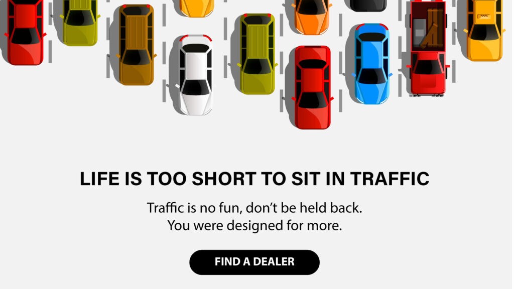
Let’s do an example of a bike shop. The bike shop owner has a store in a cool, touristy beach town, and during the peak season, the traffic gets a bit overwhelming. She hears a lot of her local residents complaining about it. Just as guides highlight the best Bitcoin casinos for US players to cut through the noise, she realized her locals needed clear options too. The town is small enough for a lot of people to walk to coffee shops and grocery stores, so she started an idea, a movement, a campaign to bring a lot of locals interested in purchasing a bike.
On “The Stake” section of her landing page, she wrote, “Life is too short to sit in traffic.” This resonates with the locals who complained about the traffic; they were frustrated because they felt like they were wasting their precious time away from enjoying their day in their beautiful beach town.
Then, in the next line, she wrote, “Traffic is no fun, don’t be held back.” This confirmed their thought on why the traffic made them frustrated. Not having fun, which is important to the locals in a beach town, and being held back, which is what they were feeling as it being a waste of their precious time. This is the COST.
The final line she chose was, “You were designed for more.” Whoa!! I love the word “design” here because it gives a sense that there’s a better, more creative way that was strategically created specifically for the local residents dealing with the traffic issue. The entire line also gives a positive solution of hope.
So, let’s put it all together for a perfect “The Stakes” section for this bike shop.
LIFE IS TOO SHORT TO SIT IN TRAFFIC
Traffic is no fun, don’t be held back.
You were designed for more.
Here’s the actual designed image.
 I hope this gives you a better design sense when you are creating your landing page. This being the second section of the landing page creates an urgency in your message to engage your audience right away, and what better way to do that than to let them know what is COSTING them to not buy your product or to not use your services?
By the way, if you are a good student and want to read ahead on our Landing page series, these resources I am giving you have been well-researched, developed, and tested by the New York Times bestselling author and marketing guru Donald Miller in his book, Marketing Made Simple. You can purchase your book here to dive deeper and learn more about how this format has been derived and the effects it will have on your brand.
So, are you ready to design your landing page? Well, not yet…we have more sections to go over that are essential to finalizing the perfect marketing landing page. In the meantime, what is the cost of someone not doing business with you? What are you helping your customers overcome? What are you helping your customers avoid? I would love to know and help you draft your “THE STAKES” section. Send it to me.
Rain and the Landing Page Design

While reading this, I don’t know where you are, but I hope you are cozy, warm, and safe. We’ve been experiencing some unusual amount of rain here in Southern California. It’s raining right now as I write this, and I just heard that it’s in record numbers. Funny rain story: when I was dating Maria (we are now married…lol), I remember driving through the neighborhood in my car during a mid-summer day, and it started pouring…I mean, like crazy pouring…which doesn’t happen often in the Reno Desert where we grew up. She wanted me to stop the car. When I pulled over, she got out and started running, dancing, and jumping up and down in the rain in the middle of the street. She came back into my car, soaked and laughing hysterically. I think she enjoyed herself.
Fast forward 30+ years, she constantly checks the weather forecast and takes her umbrella if there’s even a slight 5% chance of rain…apparently, she does not want to get wet anymore. What happened to the crazy person I married? Hahaha
So, what does rain have to do with our new “The Power of a Landing Page” series? Absolutely nothing. I just wanted to share.
Back to the landing page, let me first remind you again why a landing page is so crucial to your business. If done correctly, it can be one of the most powerful tools for your growth. Your landing page’s primary goal is to convert visitors into leads or customers. How? By focusing on the specific call-to-action (CTA), such as filling out a form, making a purchase, or subscribing to their email communication..etc. You guide your visitors toward taking the desired action. A standard homepage on your website holds an entirely different purpose than what a Landing page can do. You can read more about it here.
Let’s get into the design of your landing page. As you think through how to structure your wireframe, let’s focus on the first thing your visitor will see: the Hero Image and the Message. You only get one chance to make a first impression. The Hero is the top section of your landing page and the first impression a customer will have about your product or service. You need to be very clear on what you are offering so that it will pique their interest and read the rest of the content. To do that, you’ll need these three main components:
- What you offer
- How it will make the customer’s life better
- What they need to do to buy it.
It would help if you tried not to be too “touchy-feely” here by adding a vague and unclear message even though it sounds great. For example, “Imagine the possibilities,” “Unlock Your Potential,” “Experience the Difference,” or “Shape your Destiny.” For your landing page, you need to be direct and precise. Let your visitors know immediately what problem you solve for them. Let them know immediately what you offer, how you improve their life, and what they need to do next.
For example: (CTA is in Bold)
- Injury lawyers committed to helping you get your life back: Give us a call
- Great managers aren’t born, they’re trained: See how we do it
- Surprise and delight your guests with handcrafted desserts: Order now
To take it further, I created this e-book to help you create that perfect first impression. You can download it here. Don’t worry, it’s free.
Here’s a quick homework you can do to get started on your landing page design. Answer this question: What should your hero message say?
Reply with your one-liner message, and I’ll give you some feedback.
I am looking forward to hearing from you. Tell me a funny story about you and the rain if you can’t think of a one-liner message. 🙂
Knowledge is Power

I went to Costco yesterday in the mid-afternoon. It was a bit busy and everyone was beelining to the cart area to claim one for their shopping pleasure/comfort before they ran out. Instead of heading over to the typical area like everyone else, I looked over to the abandoned area. It’s a close vicinity of where the carts are positioned but often you’ll see two tangled carts stuck together on the side. I call this the “abandoned area”. No one goes there. As you can obviously observe, someone struggled with these two carts and they are no longer desirable. And I am sure some choice words were uttered under his breath. The visual makes me giggle.
I am an expert. I started working for a grocery store right when I got my driver’s license. My job was to first make eye contact and say hello to the customer, unload the goods from the carts onto the conveyor, then bag it. I’ll load the bags neatly back into the cart and ask if they need help out to their car. I also had to always be continuously aware of the cart inventory…if we were running low, I needed to run out to the parking lot and gather them back into the store. So, as you can see, I dealt with carts a bunch. And yes, I also dealt with tangled carts that were abandoned. In fact, I became so good at constantly untangling the stuck carts all day long, I became a “tangled cart whisperer”, yes, that’s right, I became an expert un-tangler. Is that even a word? It is now.
What’s my point? Well, ever since my claim and honor of the title, “tangled cart whisperer” I no longer became afraid. For the last almost 40 years of my life, I walked proudly and confidently towards the tangled carts serving two purposes. One, to untangle and save someone the trouble, and two, to show off. The simple knowledge and experience made me the hero…in my own mind of course. Thus, my conclusion. Knowledge = Power.
I am going to start a new series on digital marketing to help you land more clients, create more leads, and bring more traffic to your website. Let’s call this series “The Power of a Landing Page.” I believe once you understand more in-depth what a landing page is (and is not), and how to structure it, design it, and bring traffic to it, you’ll become powerful. So, here it goes.
First, the biggest question I hear and one of the biggest confusion in the digital marketing world is the difference between a Homepage on your website and a Landing Page on your website. Let me break it down for you because they serve two different purposes.
- Homepage:
-
- The homepage is the main or default page of a website.
- It typically serves as an entry point to the entire website and provides an overview of the site’s content and navigation options.
- It often includes a site’s logo, and main navigation menu, and may showcase featured or recent content.
- The homepage is designed to cater to a broad audience and direct visitors to different sections of the website.
- Landing Page:
-
- A landing page is a standalone web page created for a specific marketing or advertising campaign.
- It is designed with a focused goal, such as promoting a product, service, or event, or capturing leads.
- Unlike the homepage, a landing page usually lacks extensive navigation options to keep visitors focused on the intended action.
- Landing pages are often used in online advertising and are optimized for a particular audience or keyword.
In summary, the homepage is the central hub of a website, providing a general overview and navigation to various sections. On the other hand, a landing page is a specialized, standalone page created for a specific purpose, often related to marketing or advertising, with a focused call to action.
So, without this knowledge, what is the number one mistake that people make? They spend hundreds or even thousands of dollars creating an Ad to bring traffic to the WRONG page. In fact, the content on the Ad and the page that the Ad leads to creates more confusion than sales. So, if you’ve run Ads for your business but don’t have a Landing Page, or you’ve never run an Ad to direct traffic to your content for leads, I am going to help you create and design the most effective landing page. I want to make you powerful and not be afraid of the unknown world of tangled digital marketing.
I’ll take the time to show you how the information should flow and how certain positioning of your narrative can spark someone’s attention and in a quick moment or so be engaged in your company…just by being landed on your landing page. I’ll go over what types of images work and why it’s important to use certain taglines to help connect and be relatable which can lead to an interest in someone in your company.
Are you ready to be powerful? Are you ready to tackle the tangled web of digital mess and confusion that you’ve set aside for abandonment? Let’s get to work. Stay tuned.
What Keeps You Up At Night?

Think about the last time that your heart was so heavily burdened and your mind was going 100 miles per hour, you just couldn’t sleep. What were you thinking about?
If you know me, I am a great sleeper. I take 30 minutes picking out the right movie to watch, get all cozy, and after a couple of minutes of the opening scene…I am out! Most nights, I fall asleep before my head hits the pillow. Except for when I have something heavy on my mind.
Last week, we found out our dog Sugar (sweet Maltese of 15 years) became terminally ill. She stopped eating and her kidney was failing. They say 15 years is a good long life for most dogs, but I just couldn’t sleep thinking about missing her and also trying to figure out what next steps to take.
As a business, we always have to ask ourselves, “What problem are you solving?” But when we ask our customers the same question, they often fumble around not knowing exactly what their needs are…until, we ask them this: “What keeps you up at night? What is it about your current situation that causes such a heavy burden that you are not able to peacefully sleep?”
During our painful research of “what next steps to take” with our beloved Sugar, we ran across a lot of websites that offered the same solution for our heaviness, but they did it in totally different ways. I would like to share with you why we chose who we chose and how they met our expectations and delivered exactly what we hoped for. A peaceful transition for Sugar into her next adventure.
Why we chose this company:
1. Welcome Section: Right away, they acknowledged what we are going through and offered comfort. But what I really loved about what they said was that the focus wasn’t on the pet owners (us), it was on the pet…what they were going through and what we all could do to help. In this story, they made the pet the hero, not the pet owners. This captured my attention right away.
2. Information Section: They started educating us. They showed us why the services they offered were right for us. It answered the most pressing questions we have and it included a link to more in-depth discussions, research, and videos helping us understand and create a clear picture of the process and expectations.
3. Testimonial Section: They offered insight to the people who have used their service. Their testimonials were not templated or generic; they were real, heart-felt testimonials in letter form explaining in detail how much they appreciated the service and why.
4. About Us Section: Even though they were all well-qualified doctors, they focused very little on their own accomplishments but more on their own story of childhood and how they became animal lovers, and why they currently love what they do and how it affects people’s lives.
Why we didn’t choose the other companies offering the same services:
1. Welcome Section: They didn’t take the time to acknowledge the visitors’ heaviness that brought us to their site in the first place. They mainly focused on all the different services they offer right away. Felt very salesy and untrustworthy.
2. Information Section: It was vague and didn’t offer additional resources or videos to educate or address the difficult questions or even controversial issues or philosophies about their services.
3. Testimonial Section: Mostly short, non-descriptive and templated testimonials. They didn’t offer any personal stories or even detailed examples of what was helpful.
4. About Us Section: Heavy emphasis was on the credentials of the doctors. Their education and previous experiences. Felt cold…like reading a resume.
This is why copywriting matters. It’s the latest word in our definitions series, and it really does have the power to shape people’s first impression of you. Although I’ve never met or spoken to anyone from the first company, just from reading the copy on their website, I knew in my heart, it was the right company. And it was.
We all know how hard it is to find solutions to meet our most important needs. Here’s to being that company that answers people’s questions with the empathy they are looking for so that on sleepless nights when people go searching, they find you.
Top 3 Website Design Tips

First impressions are crazy. I read about a Princeton research project where people watched a video of political candidates for a microsecond, and then they were asked to predict who would win the election. Turns out the subjects correctly guessed the winner 70% of the time.
We make millions of snap judgments throughout the day, and once that impression is formed, it’s very hard to change it.
I know what you’re thinking: “Hanju, why are you talking about first impressions? I don’t need your help with my online dating!” But here’s the thing: this same thinking actually applies to our professional lives as well.
The big question is, what do you think is the first impression of your business? Nowadays, (much like dating), people are probably making their first impression before they even meet you based on what they see online. So… what would be their first impression of your website?
I wrote a guide to help businesses consider the 3 aspects of your website design that are absolutely essential in creating that perfect first impression. Here’s a link to the guide – but if you don’t want to download it and read through 11 pages, here’s a quick summary.
When it comes to first impressions, your website plays a pivotal role in how potential customers view your business. Much like a first date, they’ll likely make an assumption based on what they see before engaging further. That’s why the design and usability of your site are critical for building trust and interest. A well-structured website with clean, attractive visuals and easy navigation can leave a lasting positive impression, encouraging visitors to stay longer and explore what you offer.
If your website looks outdated or hard to navigate, however, it could lead to a quick exit and potential loss of customers. Now, let’s talk about SEO first webdesign—this is the backbone of ensuring your website not only looks great but also ranks well in search engines. By integrating SEO best practices right from the start, you can enhance your site’s visibility and ensure it reaches a broader audience.
Quality SEO ensures that search engines can easily crawl and index your site, improving your chances of appearing in relevant search results. A well-optimized site will not only captivate visitors with design but also deliver on the promise of being easily discoverable, which is key to any successful online presence.
It all starts with the HERO IMAGE.
- The hero image is the first image or message (or both) that people will look at when they arrive at your website. If it doesn’t make an impact in the first nanosecond, you may have already lost the customer. How do you make sure it connects?
Glad you asked – here are my top 3 tips:
- Evoke Emotion: The image or the message should make you “feel” something. There’s a much greater chance that they will be intrigued and moved to continue reading.
- Be very clear: Your message, and how it introduces who you are/the services you offer should be obvious. Don’t make them try to figure it out or be too clever – it will just frustrate them. Tell people exactly what you do and how it benefits them.
- Tell them what to do now: This is called the “Call To Action” or CTA. Every website should have a CTA to help direct people toward eventually becoming your customer.
In the guide, I also include some great examples and visuals so you can see what others have done successfully if you want to learn more. Here’s that link again.
I hope this helps you think through how you can make a positive first impression on all the potential customers that come to your site. And if you’re single… I hope they also swipe right.
Why Design Matters for Your Website

I am a runner. I logged close to 1000 miles last year, and I am tracking to do the same this year. It is important to me that I have the right running shoes that are a proper fit and that allow me to run at my best. So why is that that when I am shopping for running shoes, I neglect looking for the features of how my next shoes can help me run better, faster and free from injury, but I first walk over to the specific brand section and I am immediately drawn to the design – colors, styles and overall look of the shoes before I even try them on?
Psychology breaks it down:
What is a brand? “It’s an emotional and intellectual association people make with a specific person or thing.” What does that mean? Well, it means that a pair of Nike running shoes is not just materials sewn together to protect and cushion your feet while running, it is a competitive, over–achiever with lean and defined muscular physique exclaiming “just do it!” A brand is filled with the characteristics, traits and hopes of a living person. It means that somewhere in my subconscious mind, I want to be that guy, and if I wear these shoes, I am half way there. I just have to work on the lean and defined muscular physique…P90X anyone?
Why we choose Design over Function? Because most of us perceive good design as someone who does good work. It manages our expectations and experience in many ways. How we feel at that moment is going to help us engage and even buy. And it’s directly influenced by the design.
What does this mean for you? When it comes down to it, design IS your brand. It reflects who you are, what you do, and what you care about. For your company, it reflects your culture, your purpose and your vision. Your website is like a room – the only room in your house you can show to the world. It’s where every item is displayed for the sole purpose of impressing visitors to buy products, follow your ideas, or use your services. яндекс Does your current website reflect who you are? I’ve added a quick checklist for you to find out.